
GamePress
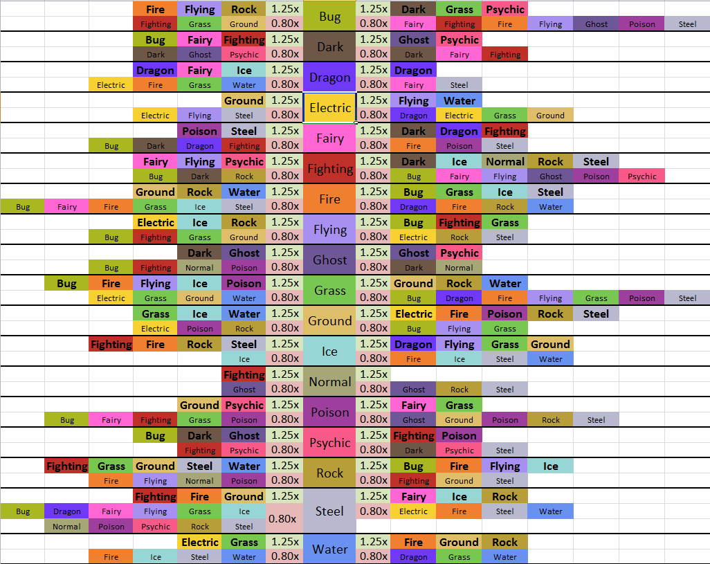
New Type Chart & colors
The new colors aren't intuitive. green = good, red = bad, that's how it should be. But after the description of, super effective and not effective (here the colors would fit) the charts switch from attacker point of view to defender point of view:
- Resistance to Damage Taken (red)
- Additional Damage Taken (green)"
And then the colors are just wrong I think.
Furthermore, tmm the new over all type chart is really good, but still I would prfer a chart like the attached one. It's so much faster to read.